Internal design portal where the system gets explored, prototyped, and codified — refined as clay, before and after features ship to customers.
The studio for the SageOx design language. In-flight explorations live here; once one proves out it lands in canonical DESIGN.md and the product tokens. Mockups stay as archaeology so future readers can see where a rule came from.
Designing for an AI-native company — guidance, not guardrails.
Guidance, not guardrails
The system shapes; it does not block. When agents drift, we tighten the system — not the leash.
Pixel-perfect is over
Token-conformant beats pixel-conformant. Where exactness matters, encode it as a contract.
Designers are design engineers
A SageOx designer writes the code that ships to production. There is no translator engineer.
The harness is the product
One hour polishing one screen vs. ten thousand. Polish the system, not the artifact.
Exploration before codification
Stress-test in the studio. Promote what proves out into tokens, components, and DESIGN.md.
Catalogs
living · per surface · auto-exportedAll catalogs →
The living visual record of every shipping surface — console, email, cast, mobile, Ox Dot, CLI. Auto-exported from each surface's live registry, so the snapshot never drifts from what ships.
Email →
Every transactional and lifecycle template — welcome, recording recaps, security receipts, engagement nudges — rendered as the real HTML a recipient receives, at web and mobile widths. 23 templates, 13 components.
Live · /internal/design-catalog →
The always-fresh interactive catalog on the running product — the route an agent hits mid ralph-loop. Auth required; the static snapshots here are the public, no-login mirror.
Explorations
in flight · dated · self-contained
Live Transcript components — current vs target
Rationalizing the live/finished transcript UX: short speaker names, paragraph coalescing, and animate-in. Shows current-vs-target for /cast and the embedded phone transcript widget. The per-speaker color ramp first explored here was removed on review (DDR-013): identity is carried by avatar + name, not color — 8 hues run out at ~4 speakers, aren't stable per person across diarizer labels, and aren't accessible on their own.
Open mockup →
Guest join via QR (account required)
Anyone who can scan a meeting QR joins the live recorded meeting as a guest, even if they aren't on the recording's team. A guest MUST be logged in (auditability — the owner sees a named roster of everyone who attended, even silent attendees), so a no-session scanner gets an account-gate detour (email magic-link, GitHub, or Google) that preserves the ?t= token across Better Auth. V1 keeps consent blunt: the act of joining IS the consent — recorded + transcribed, or no access — so there's no Record/Transcript/Off chooser and no mid-meeting toggles; recognize-my-voice is default-on but needs a voiceprint first; an already-consented guest skips the screen and drops straight into the room. The only opt-out is revoking guest access to the team (forward-only). Live room shows a Guest badge + a non-dismissible recorded strip. Implemented in sageox-monorepo#1769; pairs with the team-consent-management proposal.
Open mockup →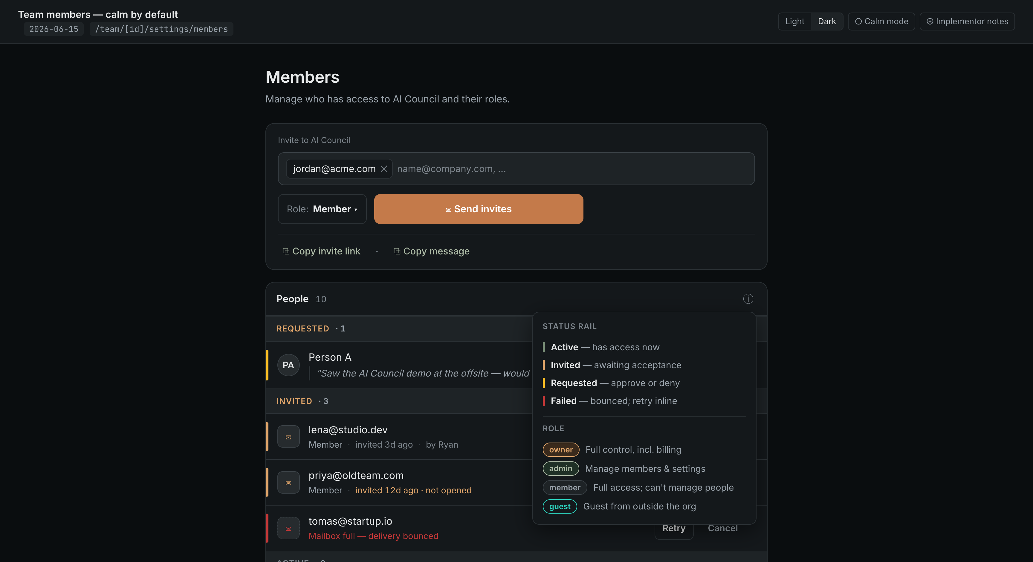
Team members — calm by default
Member management for a sub-10-person team stays a calm, short list, not a dashboard. The email-first InviteComposer leads as the one Copper CTA (any member can invite, role-capped); the roster is the Requested→Invited→Active funnel whose group-header counts ARE the stats; the rail/badge key lives behind a single ⓘ hover (DESIGN.md Rule 17), not a standing legend; stale invites fold into the Invited row as a quiet marker. Deliberately cut after review: a 6-cell stat strip, a role-mix bar, and the always-on legend.
Open mockup →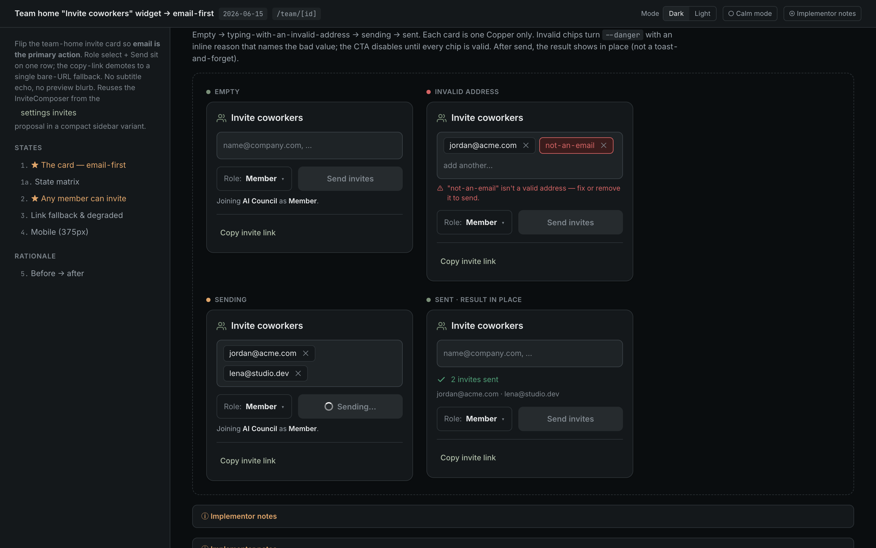
Team "Invite coworkers" widget → email-first
Flip the team-home invite card so email is the primary action: a multi-email chip composer + role select + one Copper Send invites on a single row, with the copy-link demoted to a single bare-URL fallback (no blurb, no preview). Reuses the InviteComposer in a compact sidebar variant; relaxes invite authz so any member can invite (anti-escalation guard, role shown locked above their level). Full state matrix — empty/invalid/sending/sent, plain-member vs admin, link-copied, and a degraded state where the link fails but email still works.
Open mockup →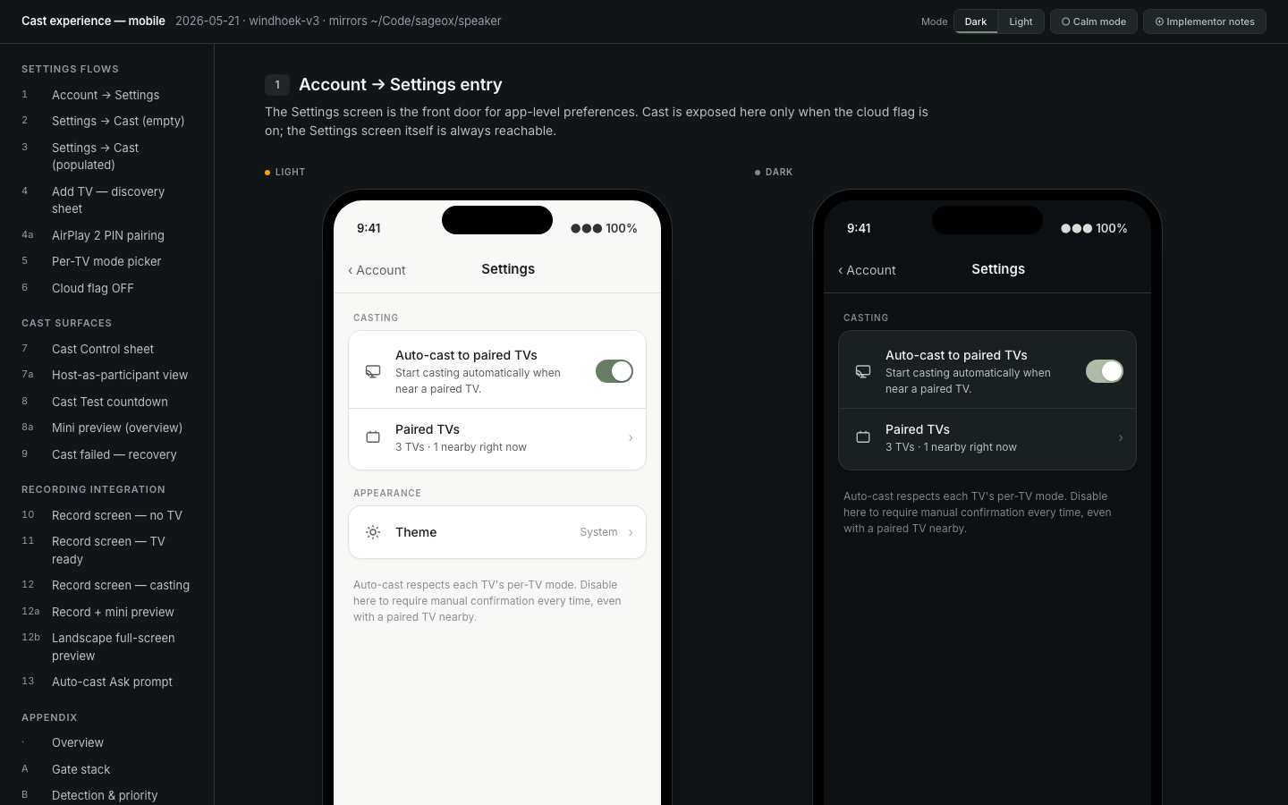
Record page — Record · Cast · Room
The active-recording surface reworked around a 3-view segmented nav — Record, Cast, Room — across private/public, paused, offline, casting (single/multi/scroll/refused/empty), the landscape preview popup, the Invite-to-join QR, and the /join participant webview. Light + dark.
Open gallery →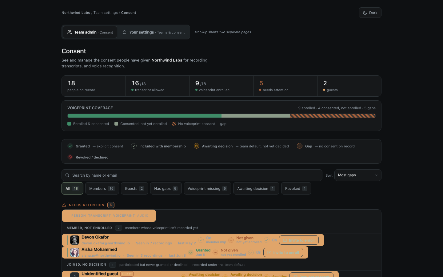
Team & user consent management
Per-team, per-modality consent, refreshed to match shipped product: admin people table with a 3-cohort Needs-attention group (member-not-enrolled, joined-no-decision, has-gaps) each with a calm outlined CTA, a new amber Awaiting-decision cell state, a Consented-not-yet-enrolled voiceprint sub-state, unknown-speakers with Play-sample + real speaking time, and a read-only user view (member Leave / guest Revoke).
Open mockup →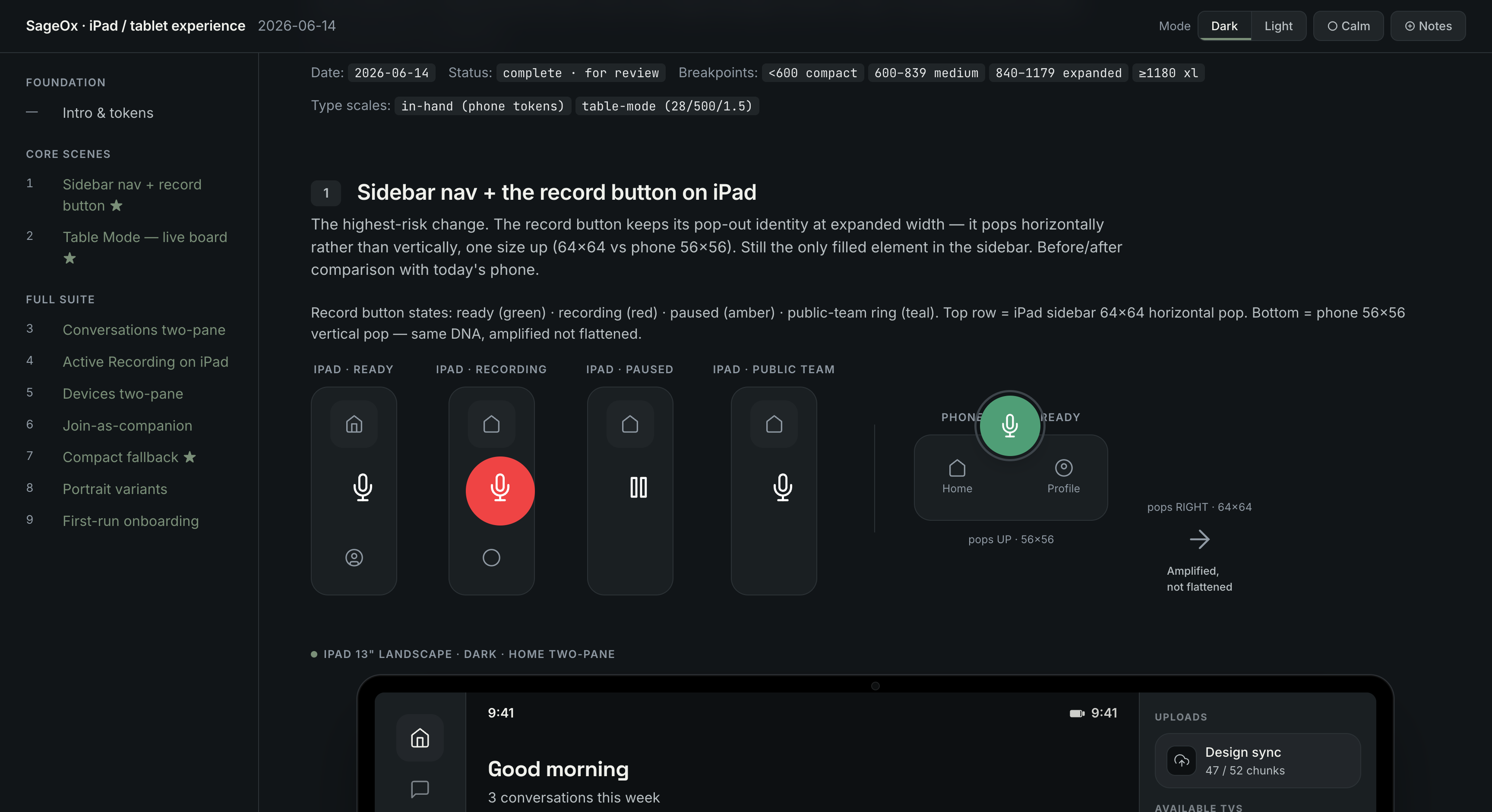
iPad / tablet experience
The iPad as the calm board in the middle of the room — a different posture from phone-as-instrument. Width-driven breakpoints (Split View / Stage Manager first-class), a leading sidebar with the loved record button amplified (rotated 64×64 pop-out, never flattened), master-detail two-pane (Conversations, Devices), and Table Mode: the iPad rendering the live meeting's signed cast.* HLS on its own glass as an across-the-table board (28pt transcript, oversized recording pulse, light glare-resistant default). Both cast-surface framings shown for the team to choose; compact <600pt falls back byte-for-byte to the phone layout.
Open exploration →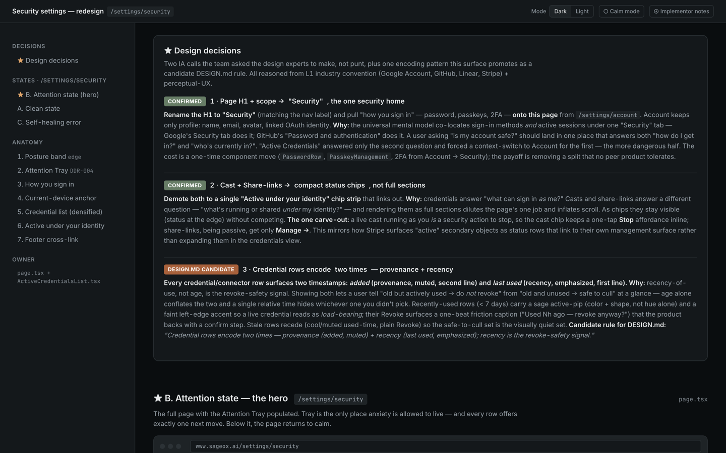
Security settings redesign
A re-think of /settings/security: a Tufte posture band with a 7-day sign-in sparkline, an Attention Tray that surfaces only what needs a decision, and credential rows that encode two times — provenance (added) muted, recency (last used) emphasized — so an actively-used connector is obviously not-to-revoke. Clean, attention, and self-healing-error states.
Open mockup →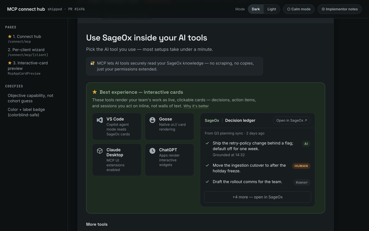
MCP connect hub — shipped redesign
Archaeology of the shipped MCP connect-surface redesign (sageox-mono PR #1496): a featured Best-experience row promoting hosts that render interactive MCP App cards (objective capability, not a cohort guess), an inline Decision Ledger card preview that shows rather than tells, Shiki-highlighted config snippets, and new Copilot Studio + Goose tiles with a provisioning-model Admin chip. Codifies DESIGN.md rules 14-16.
Open exploration →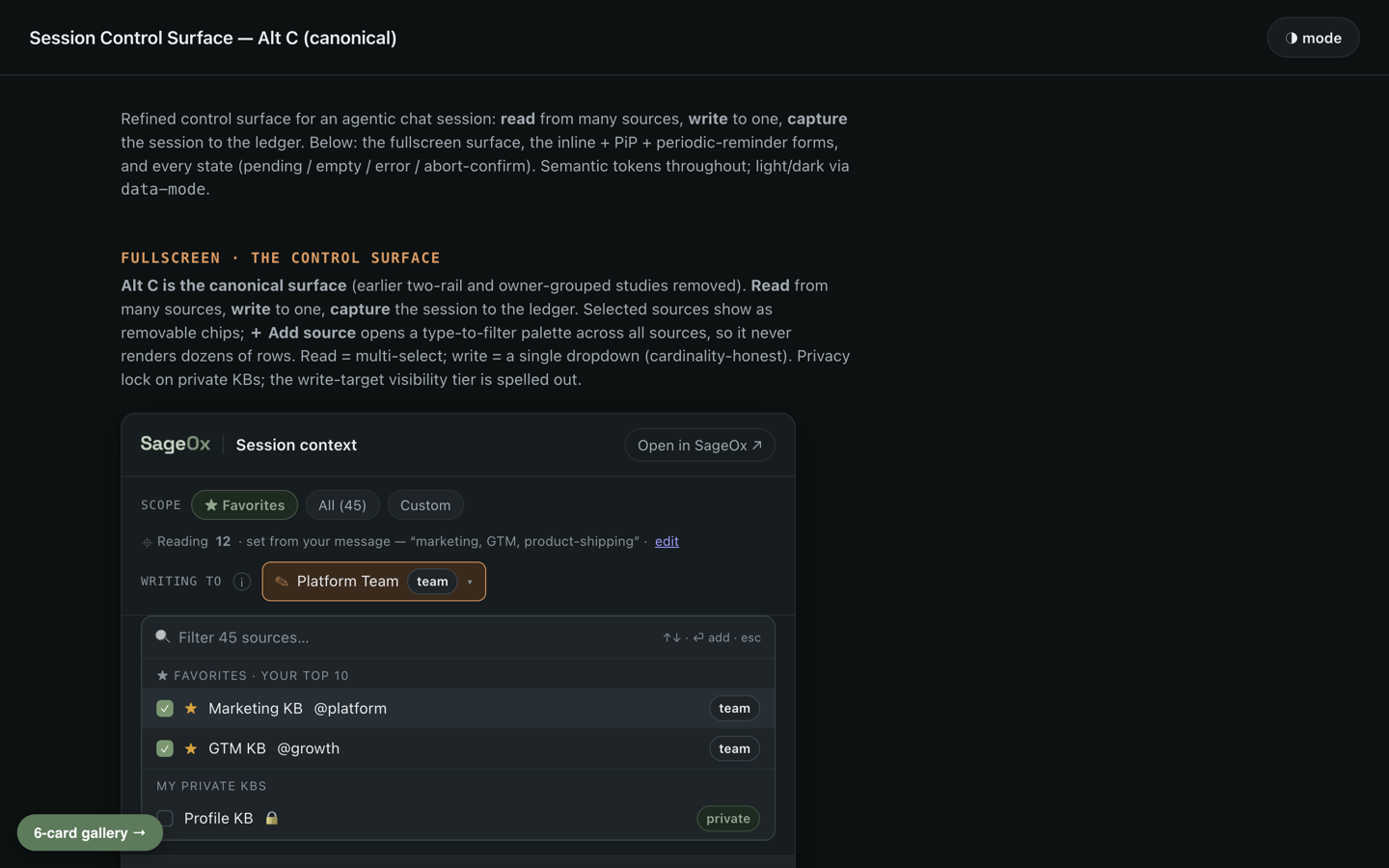
MCP App cards — catalog, control surface & PiP launcher
The live MCP App card catalog (sageox-mono PR #1494): the Alt C Session Control Surface (owner-grouped read/write scope + capture controls), a 6-card review gallery (Recording Insights, Decision Ledger, Chapter Scrubber, Recordings, Attention Tray, Team murmurs), and the PiP pill launcher (persistent session anchor: recording status + control-surface + tools + earned attention). All on the shared
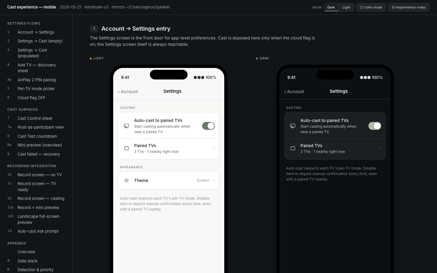
Cast experience — mobile (windhoek-v3)
Port of the Scribe firmware's cast-to-TV experience to the React Native app. Three-layer gate (cloud flag + local auto-cast + per-TV mode), Wi-Fi-free network identity via discovery-set fingerprinting, mini HLS preview (live + muted), Cast Control sheet with host-as-participant view, multi-TV chooser for corporate networks, and Sacred-data isolation on the recording screen.
Open exploration →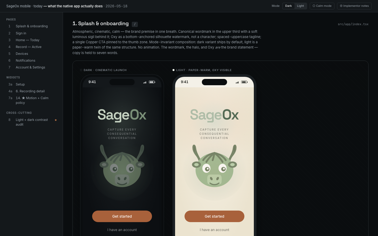
SageOx mobile · v1 (current native scope)
What the native React Native app actually does today: splash, sign-in, record setup (team or knowledge bubble), record active (chronograph timer + organic waveform + Stop, no chunk telemetry), devices, account. The companion future-web mockup covers everything else.
Open native scope →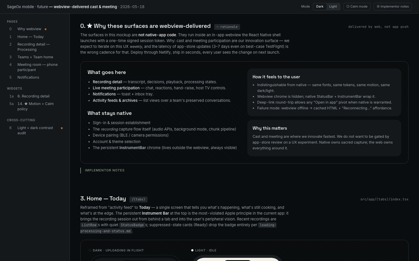
SageOx mobile · future-web (cast + meeting)
Future-facing UX delivered via in-app webview so the team can ship weekly without app-store latency. Cast, live meeting participation, recording detail with transcript and decisions, processing states, notifications, activity feeds. The native shell wraps sacred capture; webview owns everything around it.
Open webview vision →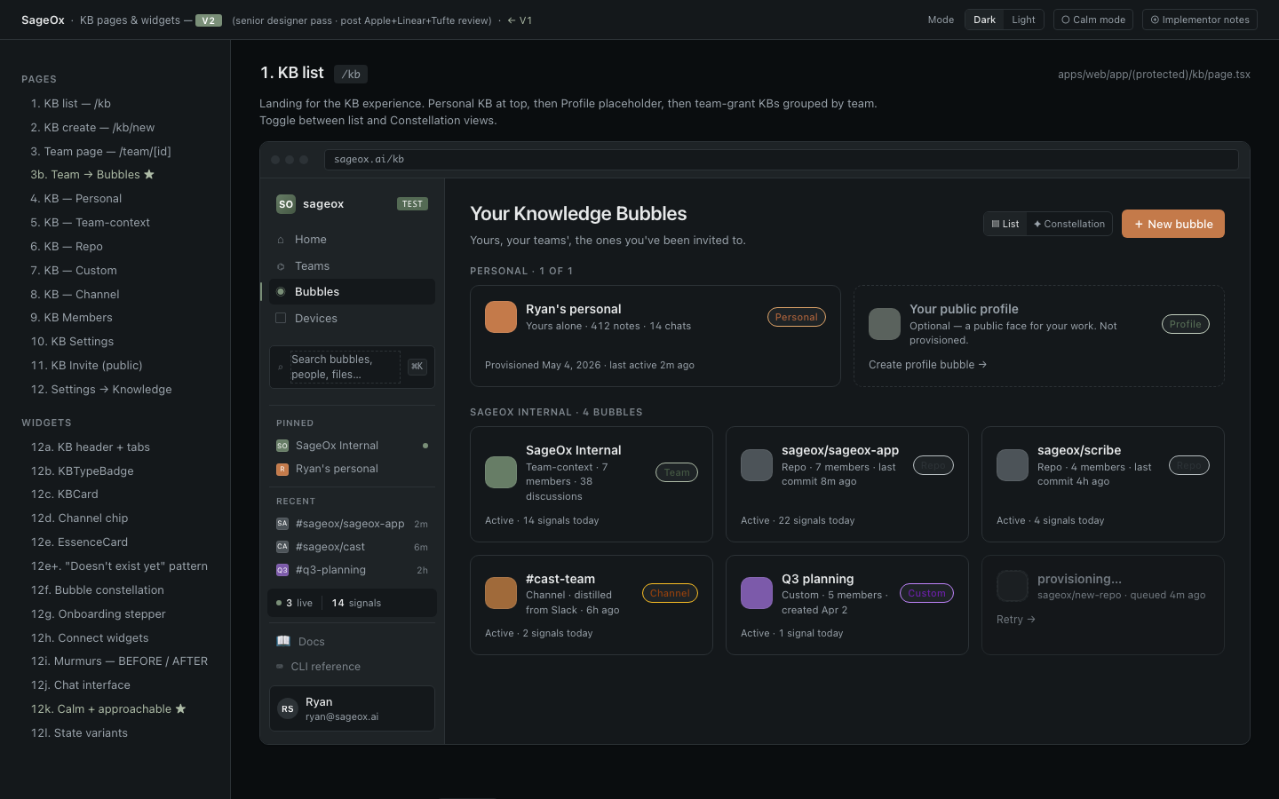
Knowledge Bubbles v2
Plain-language hierarchy, four-tier surfaces, contrast-locked dark mode, calm-mode that's quiet (not silent), and the chat rail rendering pass that replaced bubble chrome.
Open showcase →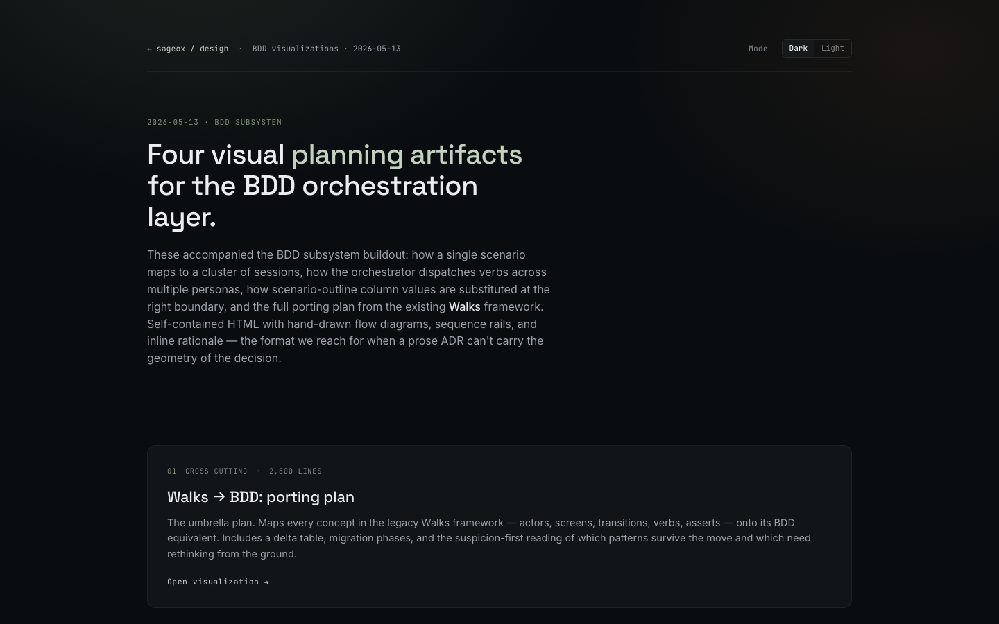
BDD visualizations — planning the orchestrator
Four self-contained planning artifacts: the Walks→BDD porting plan, the session-lifecycle cluster model, the multi-persona dispatch routing, and the scenario-outline substitution semantics. Hand-drawn flow diagrams when a prose ADR couldn't carry the geometry.
Open visualizations →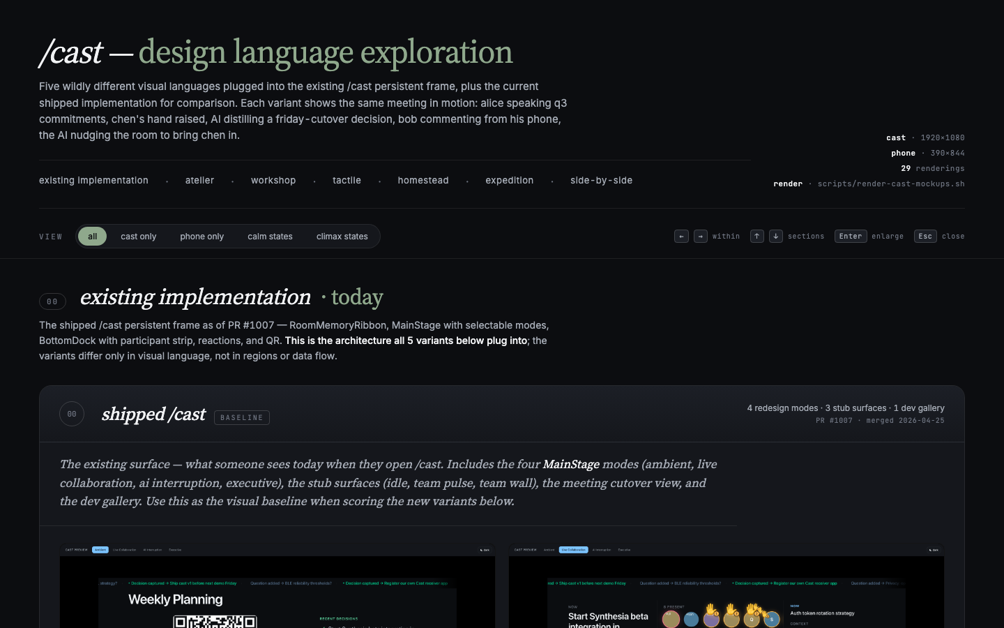
TV Cast — five design languages
Atelier, Workshop, Tactile, Homestead, Expedition. Each in calm and climax states across TV and phone. The exploration that asked: what does a meeting "destination" feel like once recording becomes ambient?
Open gallery →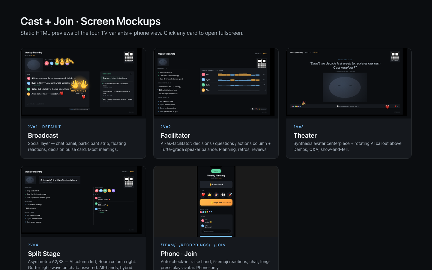
Cast TV Layouts — early variants
Four layouts — Broadcast, Facilitator, Theater, Splitstage — plus a phone join flow. The first iteration that informed the five-language pass a week later.
Open gallery →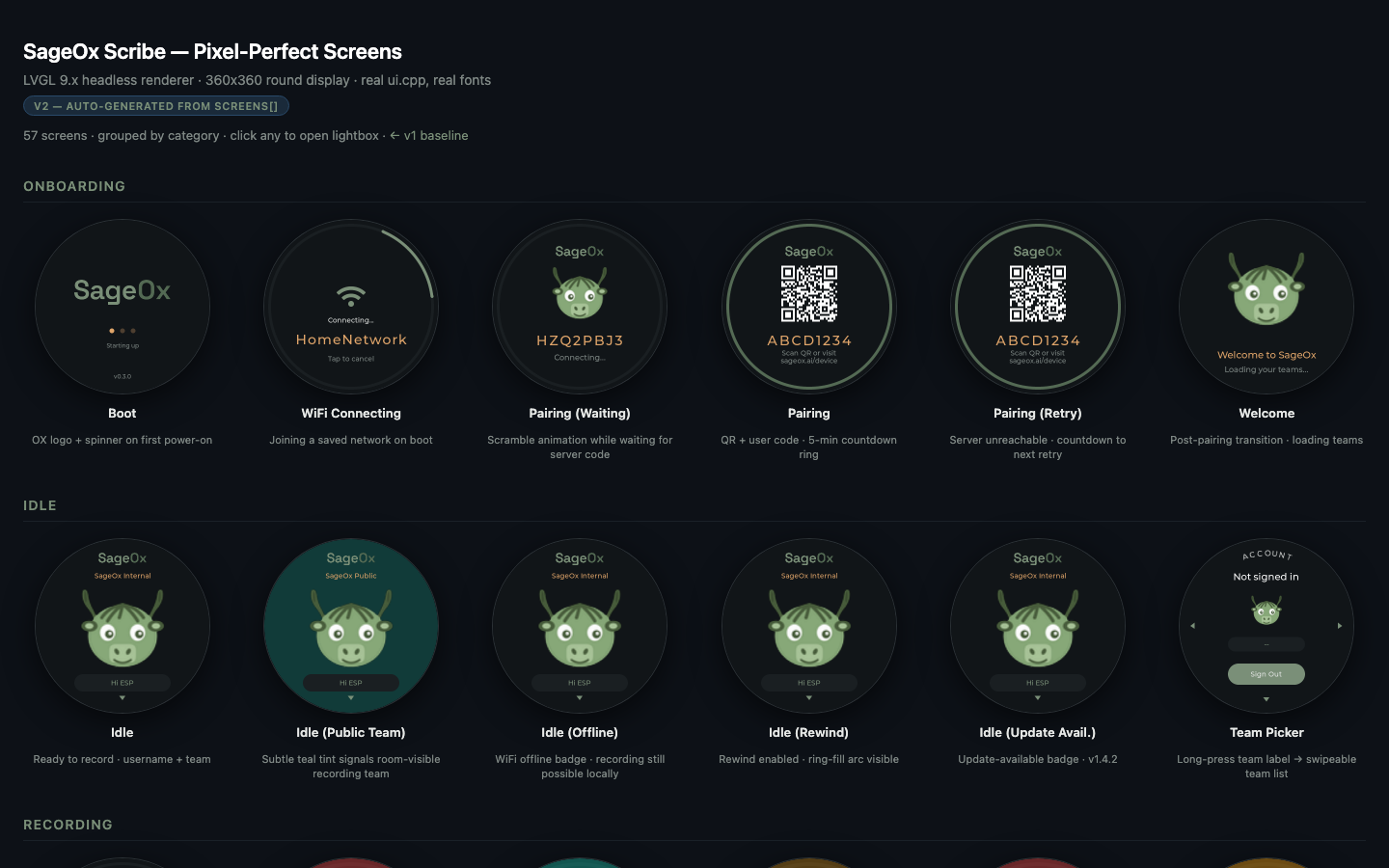
Ox Dot screens · v2
Design-system pass on the Ox Dot device UI — status arcs, pulse ring, the 30px timer, gear icon, dark QR, 150ms transitions. All 19 UI screens rendered against LVGL.
Open catalog →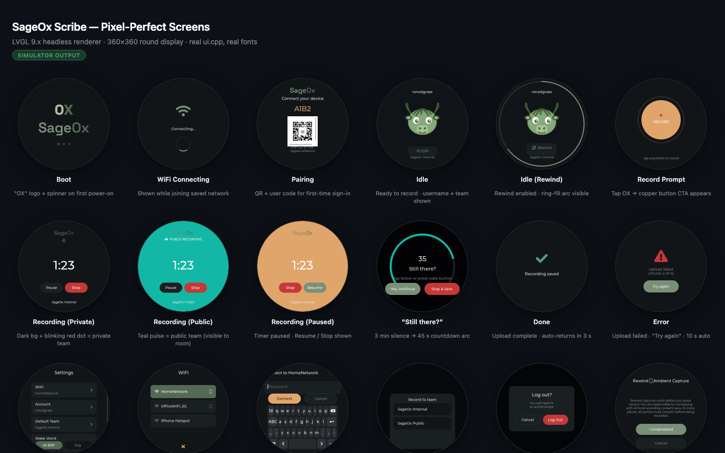
Ox Dot screens · v1
Pixel-perfect renders of the Ox Dot device UI from real ui.cpp against the LVGL headless renderer. The baseline before the design-system pass — useful for diffing what changed.