Component catalog · Console

← all explorations
Mode

SageOx component catalog · Console

Every reusable primitive in apps/web/src/components/ui/ and packages/ui/src/, plus the marketing sections rendered on the public site. This page is generated by scripts/build-static-catalog.ts from the React registry — not maintained by hand. Re-export to update.

77 components 10 categories Surface · Console Generated · 2026-05-17

Tier 3 · Surfaces

Real product pages, organized by area. Each entry's KB-conformance rating is a deliberate audit signal: partial and drifted surfaces are candidates for the KB-parity refactor epic. Screenshots arrive when the Playwright capture harness lands.

Knowledge Bubbles

The bubble list, detail pages, members, and settings. KB is the canonical refined surface — other areas are being brought up to its standard.

Chrome: TopBar + KBHeader (Overview / Members / Settings tabs) + optional chat right-rail

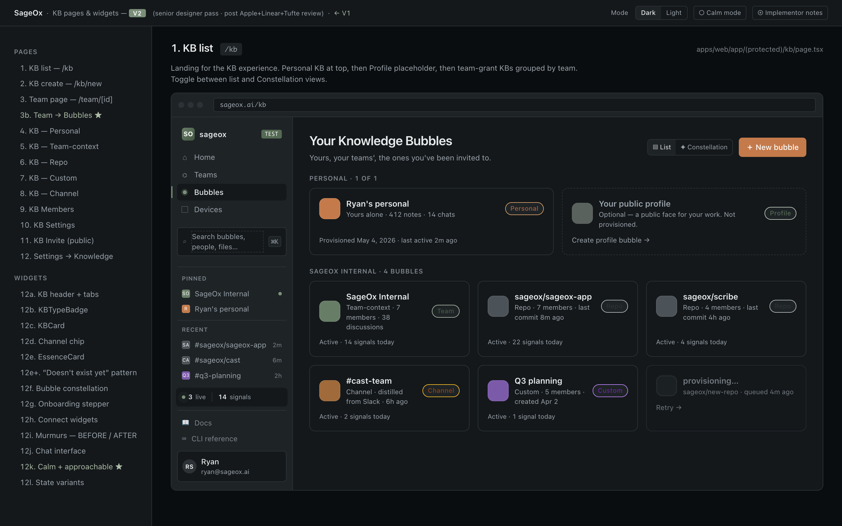
KB · List screenshot Live

KB · List

/kb
✓ matches KB

Top-level inventory of every bubble the user can see — personal, profile, org, and shared. Default landing for the KB area. Supports search at ≥6 bubbles and a constellation (spatial) view at ≥3 bubbles.

apps/web/app/(protected)/kb/page.tsx
Primary components
  • KBList apps/web/src/components/kb/KBList.tsx
  • KBConstellation apps/web/src/components/kb/KBConstellation.tsx
  • EssenceCard apps/web/src/components/kb/EssenceCard.tsx
States
  • Onboarding — No bubbles yet; EssenceCard fully expanded and undismissable.
  • Provisioning in progress — Personal/profile bubble being created server-side.
  • Provisioning failed — Retry CTA inline.
  • Populated · list view — Default. Cards grouped by section (Personal / Profile / Org / Shared).
  • Populated · constellation view — Spatial network view; only when ≥3 bubbles exist.
  • Search active — Filter input visible at ≥6 bubbles; empty-results state for no matches.
Variations
  • Pre-onboarding (collapsed essence card) vs post-onboarding
  • List vs constellation view
Design notes
  • Canonical KB shell: TopBar + breadcrumb + main column. Sets the bar for other areas.
  • Section grouping uses semantic labels (Personal / Org / Shared) not chrome — drives discoverability without visual noise.
  • Constellation toggle is power-on-demand: hidden until value threshold (≥3 bubbles) is met.
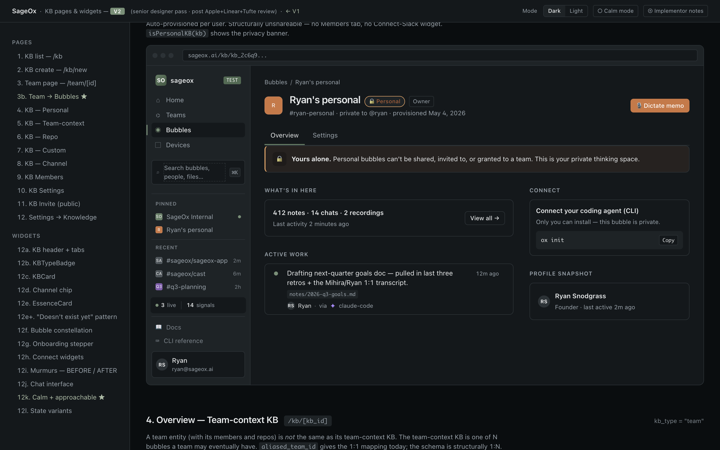
KB · Detail (Overview) screenshot Live

KB · Detail (Overview)

/kb/[kb_id]
✓ matches KB

Single bubble overview. Polymorphic by type — Personal, Profile, Team, Repo, Channel, or Custom — each renders a type-specific overview component under a shared KBHeader (tabs: Overview / Members / Settings).

apps/web/app/(protected)/kb/[kb_id]/page.tsx
Primary components
  • KBHeader apps/web/src/components/kb/KBHeader.tsx
  • PersonalOverview apps/web/src/components/kb/PersonalOverview.tsx
  • TeamContextOverview apps/web/src/components/kb/TeamContextOverview.tsx
  • RepoOverview apps/web/src/components/kb/RepoOverview.tsx
  • ChannelOverview apps/web/src/components/kb/ChannelOverview.tsx
  • CustomOverview apps/web/src/components/kb/CustomOverview.tsx
States
  • Personal — Privacy banner + recent activity. Members tab hidden.
  • Profile — Public read-only projection of personal bubble. No Members or Settings tab.
  • Team — Team events, members, context nodes.
  • Repo — Files, PRs, issues from the linked GitLab repo.
  • Channel — Channel metadata + linked repos/bubbles. Managed via team settings.
  • Custom — Generic catch-all overview (files + metadata).
  • Chat rail open — Two-column layout when /coworker chat is mounted.
Variations
  • By KB type (6 variants)
  • Chat rail open vs collapsed
  • Member vs admin view
Design notes
  • Tab bar (KBHeader) is the canonical detail-page chrome — Recordings and Teams detail should mirror it.
  • Polymorphic overview lets each type own its layout without a forced shared wrapper. Tradeoff: harder to keep visually consistent — review against this surface before adding a new type.
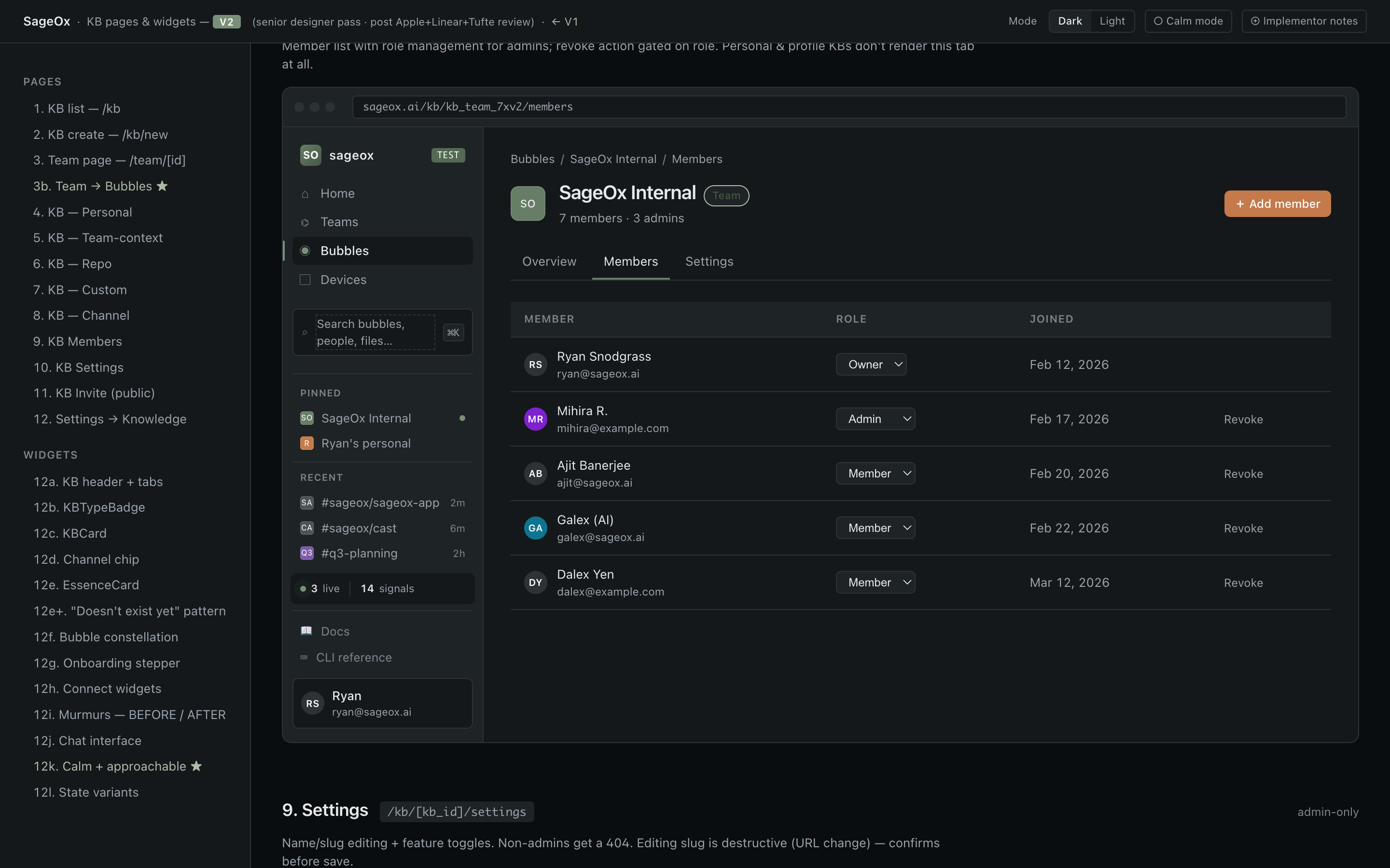
KB · Members screenshot Live

KB · Members

/kb/[kb_id]/members
✓ matches KB

Manage members of a shared bubble (team / repo / custom / channel). View-only for personal / profile bubbles.

apps/web/app/(protected)/kb/[kb_id]/members/page.tsx
Primary components
  • MemberList apps/web/src/components/kb/MemberList.tsx
  • AddMemberDialog apps/web/src/components/kb/AddMemberDialog.tsx
States
  • Member view — Read-only list with role badges.
  • Admin view — Inline role-edit + remove + invite-new controls.
  • Empty — Owner only — invite CTA.
  • Pending invite — Pending-state badge next to email.
Variations
  • Personal/Profile (tab hidden entirely)
  • Team/Repo/Custom (full editor)
Design notes
  • Member-management pattern reused by Teams (/team/[id]/settings) — consolidation candidate: extract shared MembersTable primitive.
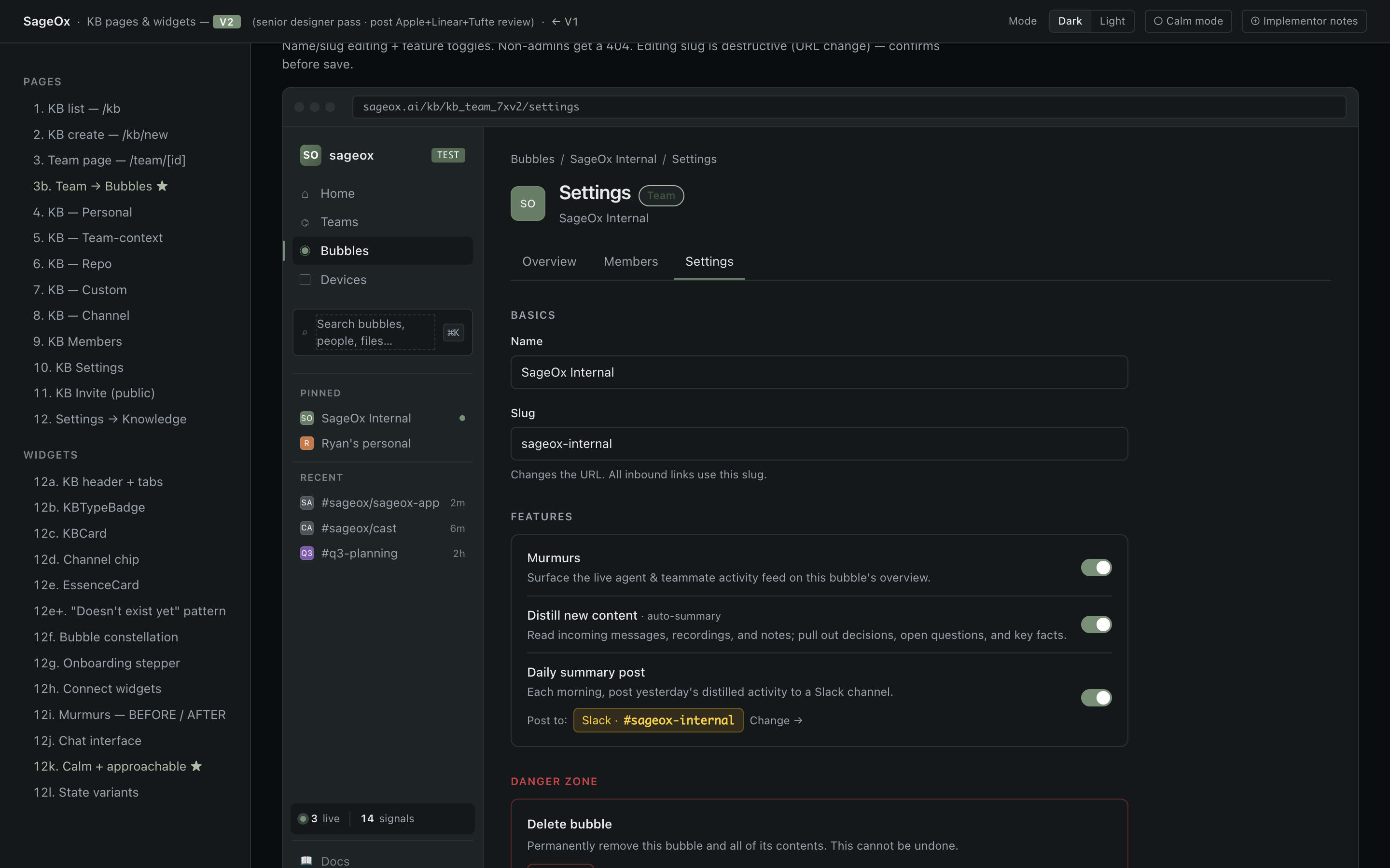
KB · Settings screenshot Live

KB · Settings

/kb/[kb_id]/settings
✓ matches KB

Edit bubble metadata, type-specific config, and delete bubble. Admin-only (404 for non-admins).

apps/web/app/(protected)/kb/[kb_id]/settings/page.tsx
Primary components
  • KBSettingsForm apps/web/src/components/kb/KBSettingsForm.tsx
States
  • Admin — All fields editable; danger-zone delete at bottom.
  • Non-admin — 404 — page-level access control.
  • Saving — Inline save indicator; form disabled during request.
Design notes
  • Page-level access control (404 on non-admin) is more decisive than disabling fields — prefer this for any admin-only surface.
  • Danger zone at the bottom mirrors Settings/Danger pattern. Should be lifted to a shared <DangerZone> primitive.
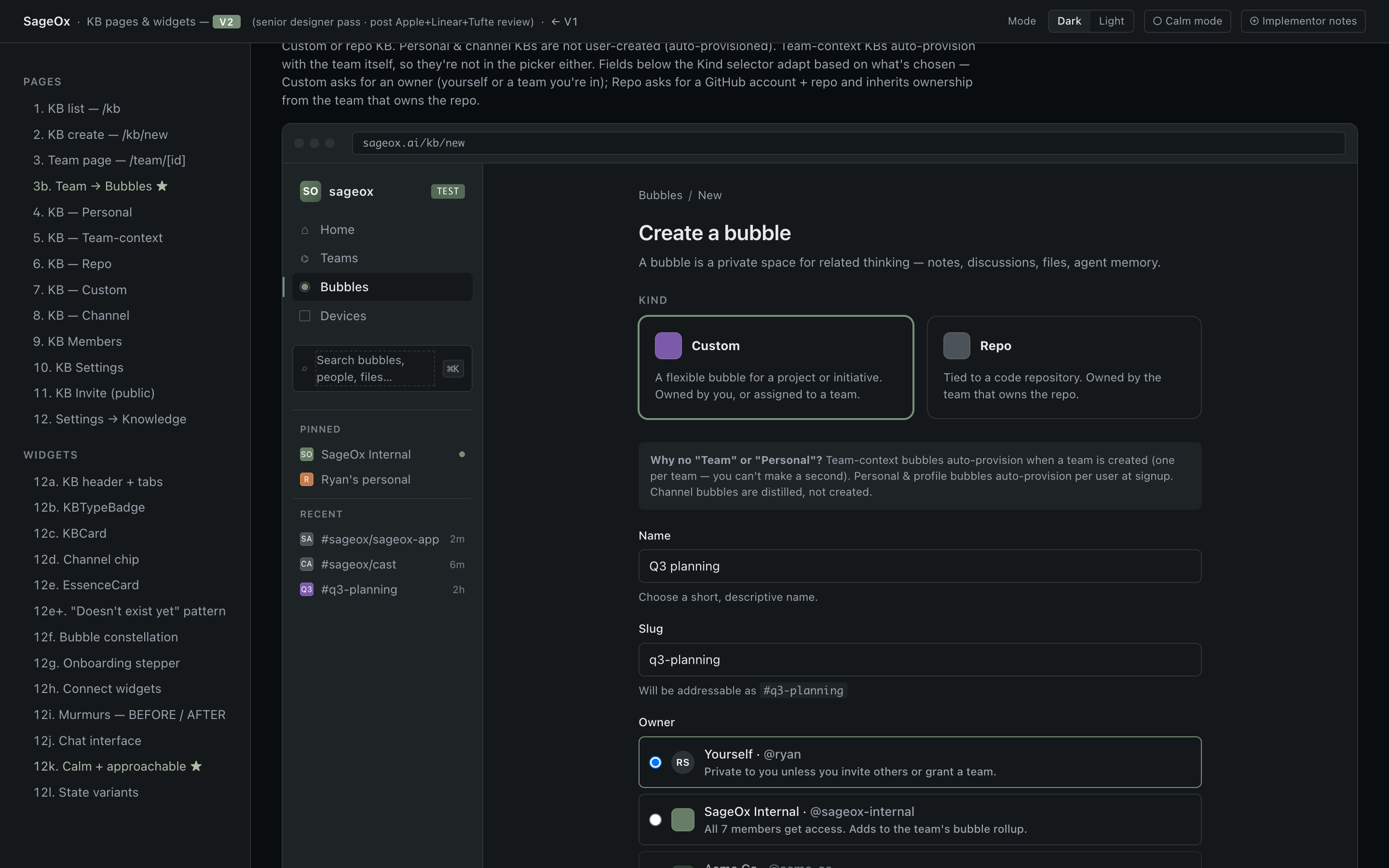
KB · Create screenshot Live

KB · Create

/kb/new
✓ matches KB

Create a new bubble. Type-selector form (personal / team / repo / channel / custom).

apps/web/app/(protected)/kb/new/page.tsx
States
  • Default
  • Type selected — Type-specific fields appear inline.
  • Submitting
Design notes
  • Inline create form, not a modal — matches the modulith "one primary action per screen" principle.
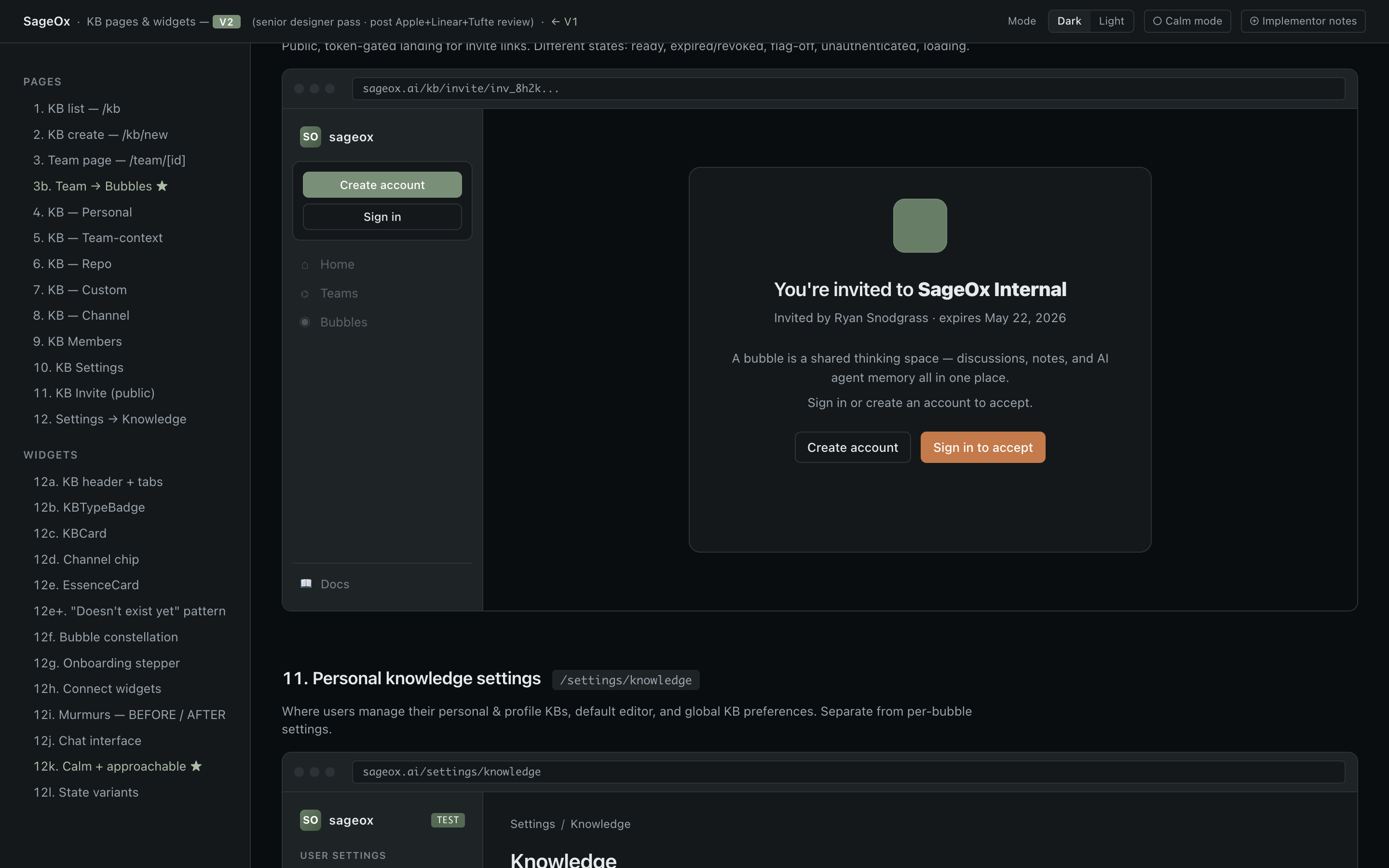
KB · Accept invite screenshot Target · KB v2 mockup

KB · Accept invite

/kb/invite/[token]
~ partial

Public invite-acceptance landing. Verifies token, shows bubble preview + Join CTA.

apps/web/app/kb/invite/[token]/page.tsx
States
  • Valid token
  • Expired/revoked
  • Already a member
  • Authenticated
  • Unauthenticated — Sign-in prompt before join.
Design notes
  • Public surface — different shell than the protected /kb routes. Re-audit against the canonical public-page pattern (currently nascent).

User Settings

Account, security, billing, developer, notifications. Flat structure under /settings/*.

Chrome: TopBar + SettingsLayout sidebar (UnifiedSettingsNav) + scrollable main

No screenshot yet

Screenshot missing — required. Drop a 1920×1080 PNG at apps/web/catalog-screenshots/console/settings-account.png and rebuild. See catalog/README.md §Screenshot requirement.

Settings · Account

/settings/account
~ partial

Profile picture, name, email, connected OAuth accounts, logout.

apps/web/app/(protected)/settings/account/page.tsx
Primary components
  • SettingsSection apps/web/src/components/settings/SettingsSection.tsx
  • SettingsCard apps/web/src/components/settings/SettingsCard.tsx
  • OAuthConnections apps/web/src/components/settings/OAuthConnections.tsx
States
  • Loaded — All fields populated; inline-edit per field.
  • OAuth disconnected — Connect button visible per provider.
  • OAuth connected — Provider name + disconnect.
  • Saving — Per-field save indicator.
Design notes
  • Uses SettingsLayout sidebar + main — different chrome from KB (which uses tabs). Pattern is fine; spacing/density don't match KB yet.
  • OAuthConnections row pattern is replicated in /settings/teams team-list and team integrations — consolidation candidate.
No screenshot yet

Screenshot missing — required. Drop a 1920×1080 PNG at apps/web/catalog-screenshots/console/settings-security.png and rebuild. See catalog/README.md §Screenshot requirement.

Settings · Security

/settings/security
~ partial

Two-factor authentication, passkeys, active sessions, password (if applicable).

apps/web/app/(protected)/settings/security/page.tsx
Primary components
  • TwoFactorSection apps/web/src/components/settings/TwoFactorSection.tsx
  • PasskeyManagement apps/web/src/components/settings/PasskeyManagement.tsx
  • ActiveSessionsList apps/web/src/components/settings/ActiveSessionsList.tsx
States
  • No 2FA configured — Setup CTA.
  • 2FA active — List of methods, backup codes link, disable button.
  • No passkeys — Add CTA.
  • Passkeys present — List with last-used + remove.
  • Sessions list — Current device pinned at top; revoke other sessions.
Design notes
  • Three distinct subsections in a single page — each is a SettingsSection card. Pattern works but density is lower than KB; cards have more chrome than they need.
  • Active sessions table is a list-with-rows pattern; doesn't use the canonical DataTable. Consolidation target.
No screenshot yet

Screenshot missing — required. Drop a 1920×1080 PNG at apps/web/catalog-screenshots/console/settings-billing.png and rebuild. See catalog/README.md §Screenshot requirement.

Settings · Billing

/settings/billing
~ partial

Subscription tier, invoice history, payment methods.

apps/web/app/(protected)/settings/billing/page.tsx
States
  • Free tier
  • Paid tier · active
  • Paid tier · past due
  • Trial · active
Design notes
  • Billing has a distinct visual register — money-flow surfaces should use Copper accent for commit actions per design rules.
No screenshot yet

Screenshot missing — required. Drop a 1920×1080 PNG at apps/web/catalog-screenshots/console/settings-developer.png and rebuild. See catalog/README.md §Screenshot requirement.

Settings · Developer

/settings/developer
~ partial

API keys, tokens — create / revoke / view-once on creation.

apps/web/app/(protected)/settings/developer/page.tsx
Primary components
  • ApiKeyManager apps/web/src/components/settings/ApiKeyManager.tsx
  • CreateTokenDialog apps/web/src/components/settings/CreateTokenDialog.tsx
States
  • Empty — No tokens yet — create CTA.
  • Token list — Masked tokens with fingerprint, last-used, expires.
  • Token created (view-once) — Full token shown once with copy button + warning.
  • Revoke confirmation — Destructive confirm dialog.
Design notes
  • View-once token reveal is a strong UX pattern — should be lifted into a shared "ViewOnceSecret" primitive (used by webhook signing keys, recovery codes, etc.).
  • Token list uses a custom table layout, not DataTable. Migration target.
No screenshot yet

Screenshot missing — required. Drop a 1920×1080 PNG at apps/web/catalog-screenshots/console/settings-notifications.png and rebuild. See catalog/README.md §Screenshot requirement.

Settings · Notifications

/settings/notifications
~ partial

Email / push / sound preferences per integration and per event type.

apps/web/app/(protected)/settings/notifications/page.tsx
Primary components
  • NotificationToggle apps/web/src/components/settings/NotificationToggle.tsx
  • NotificationSoundSettings apps/web/src/components/settings/NotificationSoundSettings.tsx
States
  • All enabled
  • Granular config — Some on, some off per category.
  • Sound preview — Plays sample on hover.
Design notes
  • Toggle-list pattern. Consider whether per-event granularity is over-design — KB-style "calm by default" suggests fewer toggles, smarter defaults.
No screenshot yet

Screenshot missing — required. Drop a 1920×1080 PNG at apps/web/catalog-screenshots/console/settings-teams.png and rebuild. See catalog/README.md §Screenshot requirement.

Settings · Teams (my teams list)

/settings/teams
~ partial

User-scoped: list teams I belong to, leave team, create new team.

apps/web/app/(protected)/settings/teams/page.tsx
Primary components
  • TeamCard apps/web/src/components/settings/TeamCard.tsx
States
  • Empty — No teams — Create CTA.
  • Member of 1+ — List of team cards.
  • Pending invite — Invite cards at top with accept/decline.
Design notes
  • TeamCard is a card-grid pattern that overlaps with KBList's sectioned cards. Consolidation target — extract a shared "EntityCard" primitive.
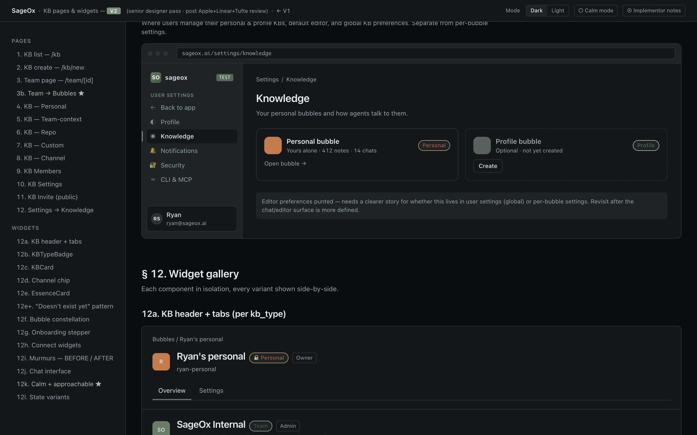
Settings · Knowledge screenshot Target · KB v2 mockup

Settings · Knowledge

/settings/knowledge
? unknown

Knowledge-base preferences: resummarization controls, batch operations.

apps/web/app/(protected)/settings/knowledge/page.tsx
States
  • Idle
  • Batch running — Progress bar + cancel.
  • Batch complete
  • Batch failed
Design notes
  • Batch-with-progress pattern. Reuse the canonical Progress + RefreshIndicator primitives — verify current code does.
No screenshot yet

Screenshot missing — required. Drop a 1920×1080 PNG at apps/web/catalog-screenshots/console/settings-danger.png and rebuild. See catalog/README.md §Screenshot requirement.

Settings · Danger Zone

/settings/danger
~ partial

Delete account, export data, irreversible actions.

apps/web/app/(protected)/settings/danger/page.tsx
Primary components
  • DangerZone apps/web/src/components/settings/DangerZone.tsx
  • DeletionStatusBanner apps/web/src/components/settings/DeletionStatusBanner.tsx
States
  • Idle
  • Confirm modal — Type-to-confirm pattern.
  • Deletion in progress — Banner with ETA + cancel during grace period.
  • Deletion canceled
Design notes
  • Type-to-confirm + grace-period + status banner is the canonical destructive-action pattern. Lift to shared <DestructiveActionFlow>.
  • Used in KB delete (per KBSettingsForm) and team delete. Three sites diverge slightly — converge.

Teams

Team hub (dashboard) + per-team settings (flat sub-routes).

Chrome: TopBar + editable team header + full-width dashboard OR settings sub-route

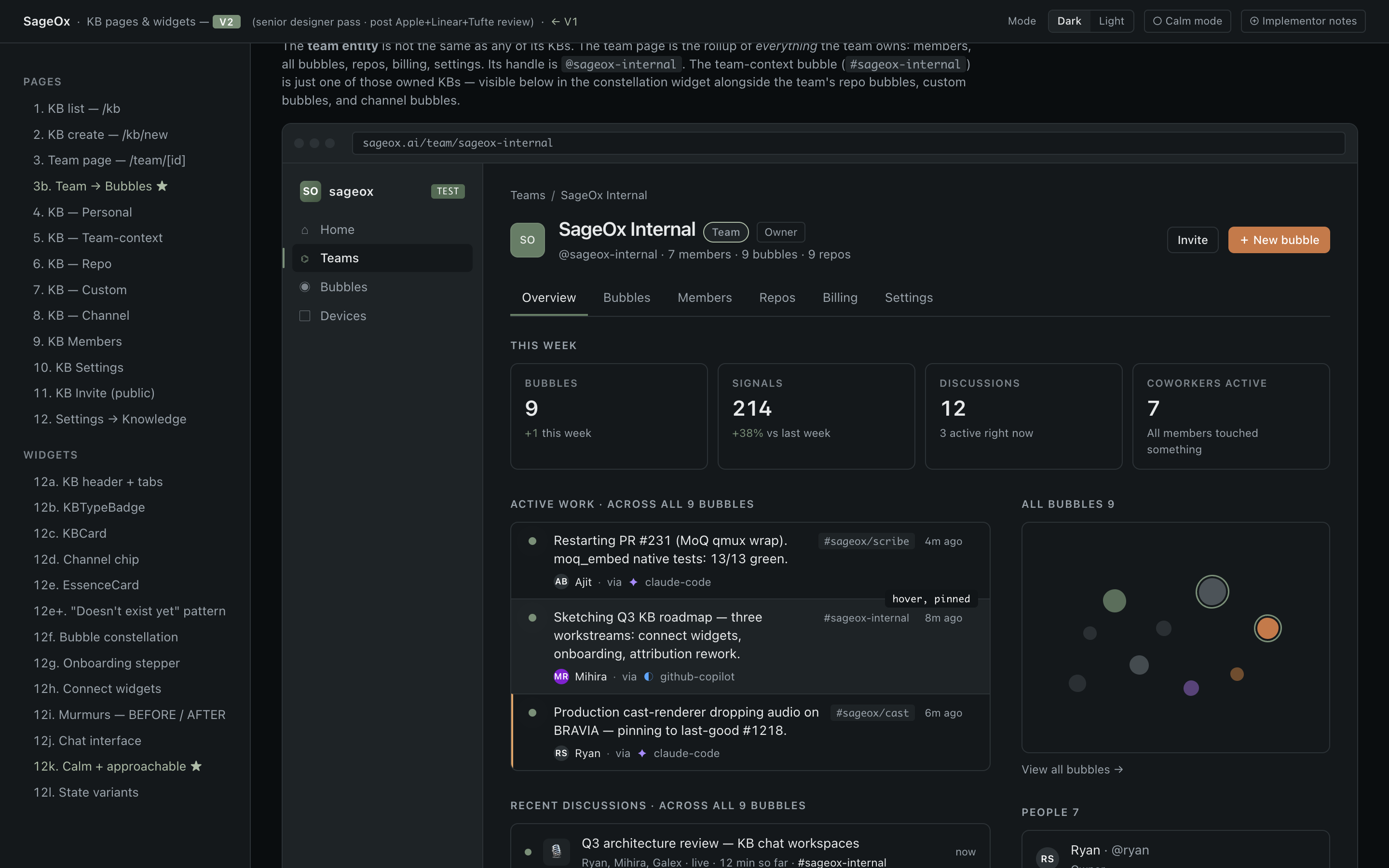
Team · Hub screenshot Target · KB v2 mockup

Team · Hub

/team/[team_id]
~ partial

Team overview dashboard. Team avatar/name header (editable for admins) + widget grid of sessions, members, recordings, bubbles, repos.

apps/web/app/(public)/team/[team_id]/page.tsx
Primary components
  • TeamAvatar apps/web/src/components/teams/TeamAvatar.tsx
  • TeamHeaderEditable apps/web/src/components/teams/TeamHeaderEditable.tsx
  • TeamSessionsSection apps/web/src/components/teams/TeamSessionsSection.tsx
  • TeamPeopleSection apps/web/src/components/teams/TeamPeopleSection.tsx
  • TeamBubblesSection apps/web/src/components/teams/TeamBubblesSection.tsx
States
  • Member view
  • Admin view — Inline-editable header + invite + manage controls.
  • Public view — Read-only projection for non-members (if visibility = public).
  • Public preview — Member toggles "preview as public"; PublicPreviewBar visible.
  • Empty — Brand-new team with only the owner.
Variations
  • Member vs admin vs public
  • Public preview mode (member-only toggle)
  • Visibility public vs private
Design notes
  • Dashboard-widget pattern is unique to the team hub. Different from KB's tab-based detail page. Consider whether this is intentional design language (teams = home base; KB = focused workspace) or drift.
  • Editable header (TeamHeaderEditable) is a high-value pattern — same inline-edit affordance should be in KB settings.
  • PublicPreviewBar is unique to teams; consider lifting to a primitive if other surfaces gain public-preview modes.
No screenshot yet

Screenshot missing — required. Drop a 1920×1080 PNG at apps/web/catalog-screenshots/console/team-list.png and rebuild. See catalog/README.md §Screenshot requirement.

Team · My teams list

/team
~ partial

Dashboard of teams the user is in. Distinct from /settings/teams (which is the same data with different chrome).

apps/web/app/(public)/team/page.tsx
States
  • Empty
  • Member of 1+
  • Pending invites
Design notes
  • Duplication risk: /team and /settings/teams render largely the same data. One should be the canonical surface; the other should redirect.
No screenshot yet

Screenshot missing — required. Drop a 1920×1080 PNG at apps/web/catalog-screenshots/console/team-media.png and rebuild. See catalog/README.md §Screenshot requirement.

Team · Media gallery

/team/[team_id]/media
? unknown

Filterable gallery of team recordings + photos.

apps/web/app/(public)/team/[team_id]/media/page.tsx
States
  • Recordings tab
  • Photos tab
  • Filtered (date range)
  • Filtered (speaker)
  • Empty
Design notes
  • Gallery-with-filters pattern. Reuse the canonical ListToolbar + filter-chips primitive.
No screenshot yet

Screenshot missing — required. Drop a 1920×1080 PNG at apps/web/catalog-screenshots/console/team-sessions.png and rebuild. See catalog/README.md §Screenshot requirement.

Team · Sessions

/team/[team_id]/sessions
? unknown

List of team work sessions (AI coworker sessions).

apps/web/app/(public)/team/[team_id]/sessions/page.tsx
States
  • Populated
  • Empty
  • Filtered
No screenshot yet

Screenshot missing — required. Drop a 1920×1080 PNG at apps/web/catalog-screenshots/console/team-context.png and rebuild. See catalog/README.md §Screenshot requirement.

Team · Context

/team/[team_id]/context
~ partial

Team knowledge base — context nodes (architectural decisions, conventions, etc.).

apps/web/app/(public)/team/[team_id]/context/page.tsx
States
  • Populated
  • Empty
Design notes
  • Overlap with KB area — team context is effectively a team-scoped knowledge bubble. Consider whether this should redirect to the team's KB.
No screenshot yet

Screenshot missing — required. Drop a 1920×1080 PNG at apps/web/catalog-screenshots/console/team-settings-general.png and rebuild. See catalog/README.md §Screenshot requirement.

Team · Settings · General

/team/[team_id]/settings
~ partial

Team name, avatar, description, visibility toggle, invite code, danger zone.

apps/web/app/(public)/team/[team_id]/settings/page.tsx
Primary components
  • InviteCodeWidget apps/web/src/components/teams/InviteCodeWidget.tsx
States
  • Default
  • Saving
  • Visibility toggle confirm — Switching to public surfaces a confirmation step.
Design notes
  • Team settings use full-width pages, NOT a sidebar. Different from user /settings which uses SettingsLayout sidebar. Decide which pattern is canonical and converge.
  • Visibility toggle deserves a stronger affordance — currently a Switch; consider a labeled toggle-group with explicit "Private · Public" segments.
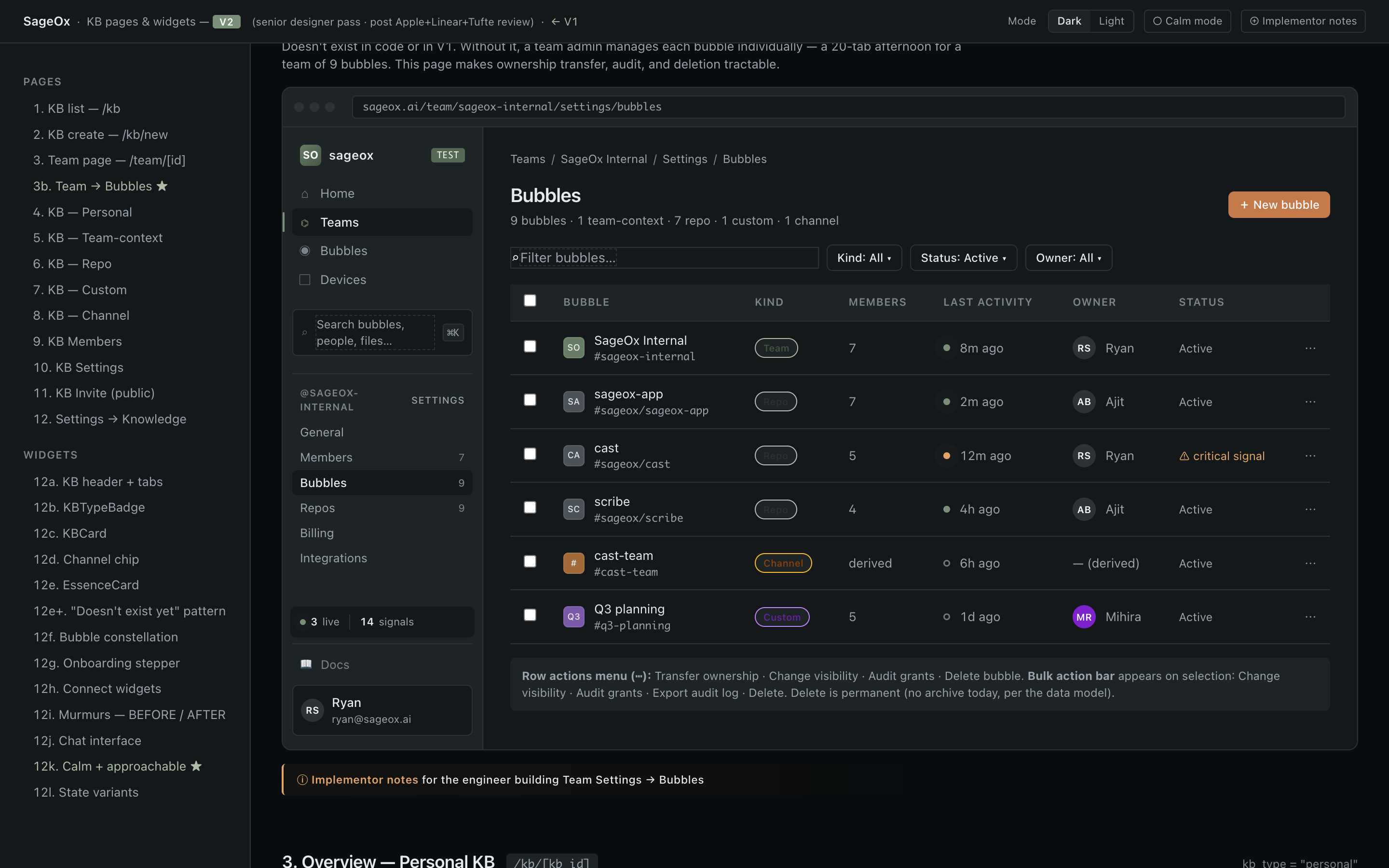
Team · Settings · Bubbles screenshot Target · KB v2 mockup

Team · Settings · Bubbles

/team/[team_id]/settings/bubbles
~ partial

Admin-level bubble management: transfer ownership, change visibility, delete, audit grants.

apps/web/app/(public)/team/[team_id]/settings/bubbles/page.tsx
Primary components
  • TransferOwnershipModal apps/web/src/components/teams/TransferOwnershipModal.tsx
  • ChangeVisibilityModal apps/web/src/components/teams/ChangeVisibilityModal.tsx
  • DeleteBubbleModal apps/web/src/components/teams/DeleteBubbleModal.tsx
  • AuditGrantsSheet apps/web/src/components/teams/AuditGrantsSheet.tsx
States
  • List
  • Transfer modal
  • Visibility modal
  • Delete confirm
  • Audit sheet
Design notes
  • Three separate modals (transfer, visibility, delete) plus a sheet (audit). Four overlay primitives in one page — opportunity to consolidate into a single contextual action panel.
  • Audit grants surface should converge with /audit area patterns (currently nascent).
No screenshot yet

Screenshot missing — required. Drop a 1920×1080 PNG at apps/web/catalog-screenshots/console/team-settings-channel-bubbles.png and rebuild. See catalog/README.md §Screenshot requirement.

Team · Settings · Channel bubbles

/team/[team_id]/settings/channel-bubbles
~ partial

Link / unlink Slack and Mattermost channels to KB channel bubbles.

apps/web/app/(public)/team/[team_id]/settings/channel-bubbles/page.tsx
Primary components
  • LinkedChannelRow apps/web/src/components/teams/LinkedChannelRow.tsx
  • AvailableChannelRow apps/web/src/components/teams/AvailableChannelRow.tsx
States
  • Linked channels list
  • Available to link
  • Linking in progress
  • Empty (no integration connected)
Design notes
  • Two parallel row types (Linked / Available) with different actions. Consider one row primitive with action-set as a slot.
No screenshot yet

Screenshot missing — required. Drop a 1920×1080 PNG at apps/web/catalog-screenshots/console/team-settings-integrations.png and rebuild. See catalog/README.md §Screenshot requirement.

Team · Settings · Integrations

/team/[team_id]/settings/integrations
~ partial

Connect / manage Slack, Mattermost, GitHub integrations at team scope.

apps/web/app/(public)/team/[team_id]/settings/integrations/page.tsx
Primary components
  • ProviderCard apps/web/src/components/teams/ProviderCard.tsx
  • ProviderIcon apps/web/src/components/teams/ProviderIcon.tsx
States
  • All disconnected — Each provider shows Connect.
  • Mixed
  • All connected — Per-provider workspace + channels CTA.
Variations
  • Per-provider connected state
Design notes
  • ProviderCard pattern is good — generic enough to be lifted into a shared IntegrationCard primitive used by user-settings OAuth too.
No screenshot yet

Screenshot missing — required. Drop a 1920×1080 PNG at apps/web/catalog-screenshots/console/team-claim.png and rebuild. See catalog/README.md §Screenshot requirement.

Team · Claim

/team/[team_id]/claim
~ partial

Claim team via invite code as part of onboarding.

apps/web/app/(public)/team/[team_id]/claim/page.tsx
States
  • Valid code
  • Invalid code
  • Claimed successfully
No screenshot yet

Screenshot missing — required. Drop a 1920×1080 PNG at apps/web/catalog-screenshots/console/team-join.png and rebuild. See catalog/README.md §Screenshot requirement.

Team · Join via link

/join/[team_id]
✗ drifted

Public join surface — invite link landing for new and existing users.

apps/web/app/(public)/join/[team_id]/page.tsx
States
  • Unauthenticated
  • Authenticated · not a member
  • Already a member
  • Link expired/revoked
Design notes
  • Public-onboarding surface. Currently lives at /join/[team_id]; KB invite is at /kb/invite/[token]. Two different invite-acceptance shells — converge.
Components

Reusable primitives that compose the surfaces above. Each shown in all variants and states.

Actions

Buttons and action triggers. One Copper CTA per view; hierarchy via variant + color.

Button

Primary action trigger. One Copper CTA per view; hierarchy via variant + color, not size.

apps/web/src/components/ui/button.tsx
Variants
Sizes
States

IconButton

Square, icon-only trigger. Toolbars, table-row actions, anything where a label would be visual noise.

apps/web/src/components/ui/icon-button.tsx
Sizes

ActionBar

Persistent bar of bulk actions over a selected list. Appears only when selection > 0.

apps/web/src/components/ui/action-bar.tsx
Search + filters + actions

CopyButton

One-shot copy-to-clipboard button. Animates a checkmark on success; falls back gracefully without clipboard API.

apps/web/src/components/ui/CopyButton.tsx
Default

Forms

Inputs, controls, validation. Composable with Label and form-state hooks.

Input

Single-line text input. Supports left/right icon slots, error state, three sizes.

apps/web/src/components/ui/input.tsx
Sizes
With icon + error

Textarea

Multi-line text input. Resizable; collapses to non-resize when disabled.

apps/web/src/components/ui/textarea.tsx
Default

Label

Accessible label for form controls. Pairs with `htmlFor` to bind to inputs/switches/checkboxes.

apps/web/src/components/ui/label.tsx
Bound to input

Checkbox

Boolean toggle. Built on Radix; supports label + description slots, three sizes.

apps/web/src/components/ui/checkbox.tsx
States
Send me weekly digest emails.

Switch

Two-state toggle for settings. Use for immediate-effect changes (Checkbox for form-submit changes).

apps/web/src/components/ui/switch.tsx
States
Email me when a recording finishes.

Select

Dropdown picker. Built on Radix; portals into body for correct stacking.

apps/web/src/components/ui/select.tsx
Default

Combobox

Searchable select. Use when option count > ~7 or when free-text entry is meaningful.

apps/web/src/components/ui/combobox.tsx
Default

Slider

Range slider. Use for continuous values with a clear domain (volume, opacity, thresholds).

apps/web/src/components/ui/slider.tsx
Default

ToggleGroup

Segmented control. Single-select or multi-select; use for mutually exclusive view modes.

apps/web/src/components/ui/toggle-group.tsx
Single

CopyableField

Read-only field with built-in copy affordance. For IDs, tokens, generated values.

apps/web/src/components/ui/copyable-field.tsx
Default
Recording IDrec_01H2Z3K4M5N6P7Q8R9S0T1U2V3W

DateRangeSelector

Compound input for selecting a start/end date range. Used in audit logs and analytics filters.

apps/web/src/components/ui/date-range-selector.tsx
See source
Live example requires state + handlers. See date-range-selector.tsx for usage.

Data display

Tables, lists, descriptions, and visualizations. Dense by default; semantic tokens.

Badge

Compact tag for status, count, or category. Six variants tied to semantic intent.

apps/web/src/components/ui/badge.tsx
Variants
Default
Primary
Success
Warning
Danger
Public
Sizes
SM
MD
LG

SemanticBadge

Status pill backed by semantic intent (success/warning/error/info/progress/pending/disabled). Auto-maps from raw status strings via `getStatusVariant`.

apps/web/src/components/ui/semantic-badge.tsx
Variants
ActiveCautionFailedNoteRunningQueuedInactive

Tag

Removable label. Use for filter chips, multi-select pills, and user-applied labels.

apps/web/src/components/ui/tag.tsx
Variants
defaultprimarysuccesswarningdangerdismissible

Avatar

Square avatar with image + fallback initials. Five sizes (xs–xl).

apps/web/src/components/ui/avatar.tsx
Sizes
RSRSRSRSRS

Table

Primitive table elements. For sorting, paging, selection, prefer DataTable.

apps/web/src/components/ui/table.tsx
Basic
NameStatusUpdated
recording-001Succeeded2 min ago
recording-002Runningjust now

DataTable

Full-featured table with sorting, selection, pagination, loading + empty states. The default for any tabular surface with more than a few rows.

apps/web/src/components/ui/data-table/DataTable.tsx
See example
Live example requires data + columns config. See data-table/DataTable.example.tsx for the full API.

DescriptionList

Key/value pairs for detail panels. Semantic <dl>/<dt>/<dd>.

apps/web/src/components/ui/description-list.tsx
Default
Recording ID
rec_01H2Z3K4M5N6P7Q8R9S0T1U2V3W
Duration
42m 17s
Speaker
scribe-12

StatCard

Single-metric card with optional trend indicator. For dashboard overviews; one number, one trend.

apps/web/src/components/ui/stat-card.tsx
Grid

Recordings

1,284

12%

Active users

312

4%

Errors

3

67%

TrendIndicator

Small ↑↓ glyph + delta for inline metric trends.

apps/web/src/components/ui/trend-indicator.tsx
Directions
+12.5%-3.2%0.0%

Sparkline

Inline mini-chart. Tufte-style data-ink; meant to live in table cells and stat cards.

apps/web/src/components/ui/sparkline.tsx
Default

SimpleLineChart

Full line chart for time series. For sparkline-scale data, prefer Sparkline.

apps/web/src/components/ui/simple-line-chart.tsx
Default
Trend chart
MonTueWedThuFriSatSun

CodeBlock

Syntax-highlighted code with optional copy. Use for snippets in docs and panels.

apps/web/src/components/ui/CodeBlock.tsx
TS snippet
typescript
import { Button } from '@/components/ui/button'

export function Example() {
  return <Button>Click me</Button>
}

Timeline

Vertical event log. For audit history, recording lifecycle, deploy events.

apps/web/src/components/ui/timeline.tsx
Default

Recording started

Speaker scribe-12 joined

Transcription running

Processing 3 of 12 chunks

Feedback

Status indicators, alerts, toasts, progress. Communicate without modal interrupts.

Alert

Inline message block. Four variants; dismissible optional. For transient toasts use ToastProvider.

apps/web/src/components/ui/alert.tsx
Variants
Standalone parts

Progress

Horizontal progress bar. Four semantic variants; supports indeterminate state.

apps/web/src/components/ui/progress.tsx
Variants

CircularProgress

Compact ring progress. For inline contexts where a horizontal bar would dominate.

apps/web/src/components/ui/CircularProgress.tsx
Values
25% complete25
60% complete60
92% complete92
100% complete100

LoadingState

Centered spinner + label for whole-panel loading. For granular shimmer, use Skeleton.

apps/web/src/components/ui/loading-state.tsx
Default

Loading recordings…

Loading recordings…

LoadingSkeleton

Higher-level loading shell built on Skeleton primitives. Use to placeholder a known layout shape.

apps/web/src/components/ui/loading-skeleton.tsx
Default

Skeleton

Primitive shimmer block. Compose into card / table / avatar shapes with SkeletonAvatar / SkeletonCard / SkeletonText.

apps/web/src/components/ui/skeleton.tsx
Composed

RefreshIndicator

Subtle "updated N seconds ago" affordance for live data. Spins while fetching.

apps/web/src/components/ui/refresh-indicator.tsx
Default
Updating...

Toast

Transient notification. Mount ToastProvider near root; call useToast() from anywhere.

apps/web/src/components/ui/toast/ToastProvider.tsx
See example
Toasts mount at the app root via ToastProvider. See toast.example.tsx.

EmptyState

Zero-data presentation. Icon + headline + supporting text + primary CTA.

apps/web/src/components/ui/empty-state/EmptyState.tsx
Default

No recordings yet

Connect a speaker or upload a file to get started.

Navigation

Tabs, breadcrumbs, menus, command palettes. Keyboard-first.

Tabs

Radix-based tab group. Two visual variants: underlined (default) and pills.

apps/web/src/components/ui/tabs.tsx
Default
Overview content
Pills

TabNav

Page-level tab navigation that maps tabs to routes. For in-page tabs, use Tabs.

apps/web/src/components/ui/tab-nav.tsx

LinkTabs

Lightweight, link-styled tab row. Use when underlines feel too heavy.

apps/web/src/components/ui/link-tabs.tsx
Default

Breadcrumbs

Hierarchy trail. Last item is rendered as plain text (current location).

apps/web/src/components/ui/breadcrumbs.tsx
Default

Command

Command palette primitive (cmdk). Wire under Cmd+K; supports nested groups, keyboard nav.

apps/web/src/components/ui/command.tsx
Default

ListToolbar

Filters + sort + view-switcher bar above a list. Slot-based; left/right sides for primary/secondary controls.

apps/web/src/components/ui/list-toolbar.tsx
Default
147 recordings

LoadMoreFooter

Pagination footer with explicit "load more" button. Use for infinite lists where auto-scroll would feel jarring.

apps/web/src/components/ui/load-more-footer.tsx
Default
Showing 20 of 147·

Overlays

Dialogs, popovers, tooltips, slide-overs. Animations are decisive (250ms in, 200ms out).

Dialog

Modal dialog. Composable header / footer; built on Radix. Animates 250ms in, 200ms out.

apps/web/src/components/ui/dialog/Dialog.tsx
Default

Popover

Floating panel anchored to a trigger. For non-modal disclosures (filter pickers, mini-forms).

apps/web/src/components/ui/popover.tsx
Default

Tooltip

Hover/focus tooltip. Provider must wrap the page or app root.

apps/web/src/components/ui/tooltip.tsx
Default

DropdownMenu

Click-triggered menu. Keyboard accessible; supports labels, separators, nested items.

apps/web/src/components/ui/dropdown-menu.tsx
Default

Accordion

Vertical collapse group. Single or multi-open; use for FAQ-style content and progressive disclosure.

apps/web/src/components/ui/accordion.tsx
Default

Collapsible

Single open/close primitive (Accordion = repeated Collapsibles). Use for show-more sections.

apps/web/src/components/ui/collapsible.tsx
Default

Layout

Page containers, panels, grids, separators — structure without decoration.

Card

Container with header/content/footer slots. The default surface for grouped content.

packages/ui/src/Card.tsx
Compound parts
Workflow run
Started 2 minutes ago

Transcription is running on 3 of 12 chunks.

CardGrid

Responsive grid wrapper for Card. 1 → 2 → 3 columns at sm / md / lg.

apps/web/src/components/ui/card-grid.tsx
Default
Item 1

Grid cell content.

Item 2

Grid cell content.

Item 3

Grid cell content.

BorderedPanel

Plain bordered container without Card chrome. For tight groupings inside larger layouts.

apps/web/src/components/ui/bordered-panel.tsx
Default
A bordered panel. Less chrome than Card; more presence than a plain div.

PageContainer

Standard page-width wrapper with consistent padding. Wraps top-level page content.

apps/web/src/components/ui/page-container.tsx
Default
Page content sits inside a max-width container with consistent gutters.

Separator

Horizontal or vertical divider. Uses ox-border token; flips with mode.

apps/web/src/components/ui/separator.tsx
Horizontal
Above
Below
Vertical
Left
Right

InheritanceIndicator

Marks a setting as inherited from a parent scope (workspace, team). Used in settings panels.

apps/web/src/components/ui/inheritance-indicator.tsx
Default
Orgenabled
Workspaceenabled
Project(not set)
Compact
ProjectWorkspaceOrg

Status

Pipeline states (pending → running → succeeded → failed). Semantic colors carry meaning.

StatusDot

Single-color circle for pipeline status. Three sizes; auto-pulses on `running`.

apps/web/src/components/ui/StatusDot.tsx
States
pending
running
succeeded
failed
warning
info

StatusBadge

Icon + label badge for pipeline status. Spins on `running`. Use over generic Badge when status is semantic.

apps/web/src/components/ui/StatusBadge.tsx
States
PendingRunningSucceededFailedWarningInfo

TranscriptionStatusBadge

Specialized status badge for the transcription pipeline. Maps backend lifecycle states to icons + colors.

apps/web/src/components/ui/TranscriptionStatusBadge.tsx
See source
Requires a transcription state value. See TranscriptionStatusBadge.tsx.

ComingSoon

Placeholder for unimplemented surfaces. Honest signal beats fake UI.

apps/web/src/components/ui/ComingSoon.tsx
Default

Custom dashboards

On the roadmap for Q3.

AgentPrompt

Highlight box for AI-coworker suggestions. Marks AI-originated content visually distinct from human input.

apps/web/src/components/ui/AgentPrompt.tsx
Default
See AgentPrompt.tsx for prop signature.

Composition patterns

Tier 2: combinations of primitives that appear in 3+ places. Catalogue once so we can spot drift and consolidate. The goal is to delete patterns over time as they collapse into shared components.

List · toolbar · pager

The canonical list shell: ListToolbar (count + sort + filter slot) → table or rows → LoadMoreFooter. Used in /kb, /recordings, /audit, /team/[id]/members.

pattern · canonical: apps/web/app/(protected)/kb/page.tsx
Composed
147 recordings
RecordingSpeakerStatus
kickoff.m4ascribe-12Succeeded
review.m4ascribe-04Running
Showing 2 of 147·

Detail · header · tabs

Detail-page chrome: avatar + title + meta + type badge + tabbed content. KBHeader is the canonical implementation; Recordings, Teams detail, and Cast should mirror.

pattern · canonical: apps/web/src/components/kb/KBHeader.tsx
Composed
SO

SageOx Engineering

Team
@sageox-engineering

Empty state · primary CTA

Zero-data presentation. EmptyState primitive — large variant for full-page empties (no recordings, no bubbles); inline variant for in-card empties.

pattern · canonical: apps/web/src/components/ui/empty-state/EmptyState.tsx
Full page

No recordings yet

Connect a Scribe or upload a file to start capturing meetings.

Destructive confirm · type-to-confirm

Type-to-confirm destructive action. Used for delete account, delete bubble, delete team. Three near-duplicate implementations today — consolidate into a single <DestructiveActionFlow>.

pattern · sites: teams/DeleteBubbleModal.tsx, settings/DangerZone.tsx, kb/KBSettingsForm.tsx
Type-to-confirm

Delete bubble

This deletes team-engineering and all its content. This cannot be undone.

Inline-editable field

Click-to-edit fields on detail pages. TeamHeaderEditable is the canonical pattern; should be lifted into a shared primitive that KB settings, profile name, etc. can reuse.

pattern · canonical: apps/web/src/components/teams/TeamHeaderEditable.tsx
Display → edit → save

SageOx Engineering

Status pipeline strip

Horizontal strip showing a multi-stage pipeline (pending → running → succeeded → failed). Used for recording lifecycle, transcript pipeline, deploy status.

pattern · sites: recordings detail header, transcript chips in /kb
Recording pipeline
CapturedConcatenatedTranscribingSummarized

Coworker (AI) suggestion card

Highlight card for AI-coworker output — visually distinct from human-authored content. Used in chat threads, inline doc suggestions, and the command palette.

pattern · canonical: apps/web/src/components/ui/AgentPrompt.tsx
In-context suggestion
✦ AI suggestion
Consider running make typecheck before pushing — three new TypeScript errors in the diff.

Share token · view-once secret

View-once secret reveal: token shown once after creation, copy button + permanent warning. Used for API keys, share-link tokens, recovery codes. Lift to <ViewOnceSecret> primitive.

pattern · sites: apps/web/src/components/settings/ApiKeyManager.tsx
Just generated
Save this token now. It won't be shown again. We only store its fingerprint.
tok_01H2Z3K4M5N6P7Q8R9S0T1U2V3W

Integration provider row

Row representing an external integration (Slack, Mattermost, GitHub, OAuth provider) with icon + label + status + connect/disconnect. Three near-duplicate implementations today.

pattern · sites: teams/ProviderCard.tsx, settings/OAuthConnections.tsx
Mixed states
Sl
Slack
sageox-team.slack.com
Connected
Gh
GitHub
Not connected

Public-preview banner

Banner shown when an authenticated user is previewing a public surface as a visitor would see it. Unique to teams today; candidate for public KB pages.

pattern · canonical: apps/web/src/components/teams/PublicPreviewBar.tsx
Bar visible
PreviewYou're seeing this team as a public visitor would.

Setting inheritance · scope cascade

Shows a setting cascading through scopes (Org → Workspace → Project). Active scope is highlighted. Used in feature-flag overrides, notification rules, KB visibility defaults.

pattern · canonical: apps/web/src/components/ui/inheritance-indicator.tsx
Workspace-active
Orgenabled
Workspaceenabled
Project(not set)

Activity feed · timeline

Reverse-chronological event feed with semantic status dots. Used for audit logs, recording lifecycle, deploy events, murmur threads.

pattern · canonical: apps/web/src/components/ui/timeline.tsx
Recording events

Recording uploaded

Speaker scribe-12 joined

Transcription in progress

3 of 12 chunks complete

Settings section card

Grouping card for related settings (label + description + control). Used throughout /settings/*. Often nested with sub-rows — review whether nested chrome is earning its place.

pattern · canonical: apps/web/src/components/settings/SettingsSection.tsx
With sub-rows
Two-factor authentication
Add a second verification step at sign-in.
Authenticator app
Active
Recovery codes

Invite acceptance · public landing

Public landing for a shared invite token (KB invite, team join). Two near-duplicate implementations at /kb/invite/[token] and /join/[team_id] — converge into one shell.

pattern · sites: /kb/invite/[token]/page.tsx, /join/[team_id]/page.tsx
Authenticated, valid
SO
Join SageOx Engineering
12 members · created 2024

Tokens

The raw values underneath — color scales, type ramp, spacing, motion. Reference for what every component composes from.

Foundations

Color tokens, typography, spacing — the visual primitives every component composes from.

Color tokens

Semantic palette — sage (primary), copper (commerce CTA), charcoal (neutral). Always reference via tokens, never raw hex.

packages/ui/src/tokens.css
Sage
Sage (Primary)
50
100
200
300
400
500
600
700
800
900
Copper
Copper (Commerce CTA)
50
100
200
300
400
500
600
700
800
900
Charcoal
Charcoal (Neutral)
50
100
200
300
400
500
600
700
800
900

Typography

The type scale. Inter for UI; system mono for code. Hierarchy through size and weight, never decoration.

apps/web/src/styles/typography.css
Scale
Display 4xl — semibold
Heading 2xl
Subheading lg
Body base — the default reading register for product surfaces.
Muted sm — secondary information, table chrome.
Eyebrow xs uppercase
Mono — sage-500 = #5FAE86